Granada
Well-known member
- Joined:
- Oct 14, 2019
- Posts:
- 11,439
- Liked Posts:
- 2,667




Yeah I was going to say it doesn't look bad but it feels pretty familiarIt's nice, but i feel like I have seen pretty much the same thing as a hoodie, and Ive been waiting for the barber pole remake every time a new jersey is being released
I think this is the hoodie I'm thinking of... The striping is actually probably better than the new jersey
View attachment 8504
Butt ugly. Especially for a team with the classiest unis in the biz. The Chief deserves better.Yeah I was going to say it doesn't look bad but it feels pretty familiar


It's not bad. It could be worse like Detroit's or Anaheim's


I can't believe Anaheim brought back those jerseys. Here are the other ones, definitely could have been worse for the Blackhawks compared to some of these: Reverse Retro alternate jerseys for all 31 teams unveiled by NHL, adidas


All Anaheim had to do is use the original duckmask logo and they would have been gold...but they came out with that.I can't believe Anaheim brought back those jerseys. Here are the other ones, definitely could have been worse for the Blackhawks compared to some of these: Reverse Retro alternate jerseys for all 31 teams unveiled by NHL, adidas
Yup...another one that they screwed up.Winnipeg had one job.
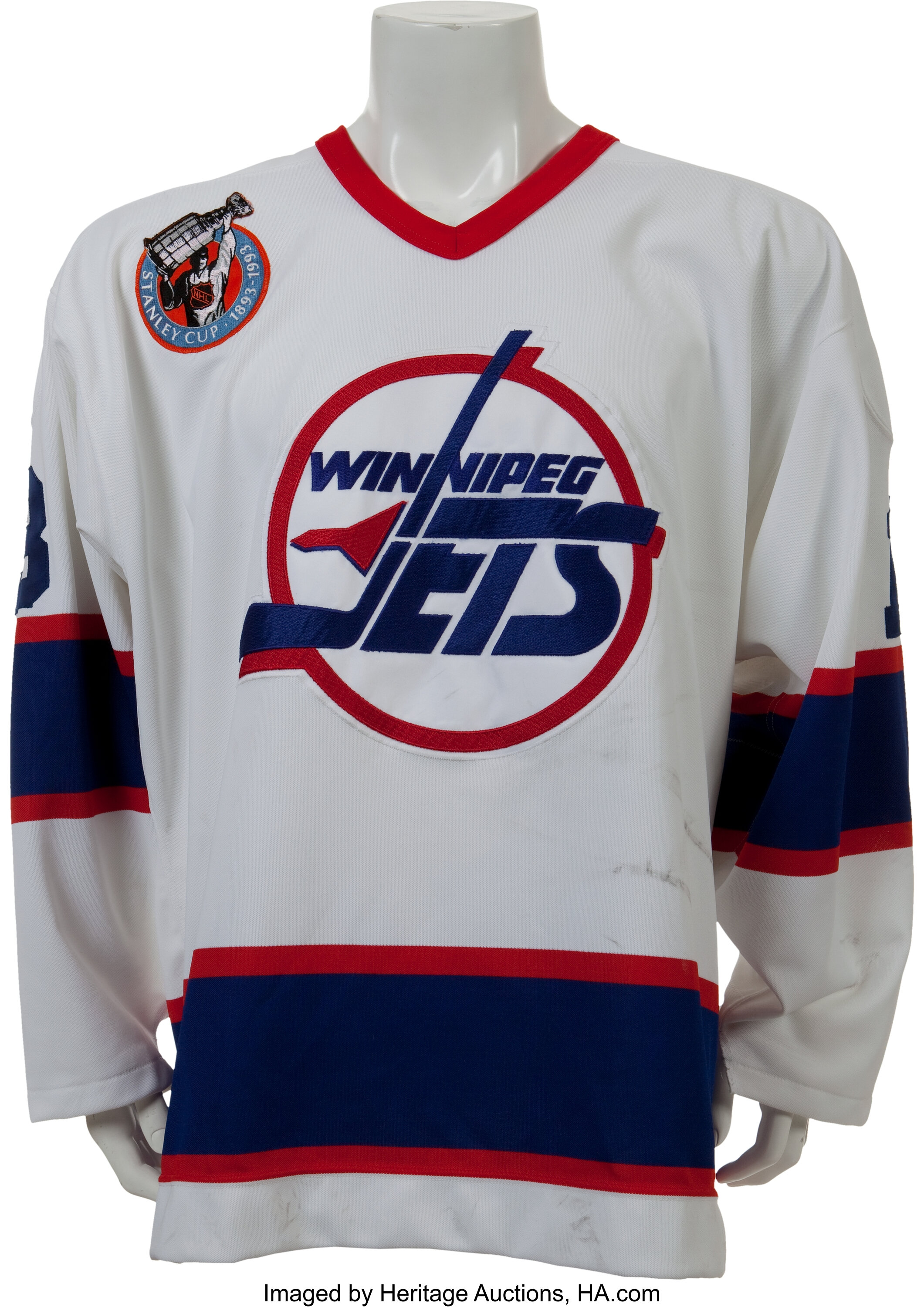
All Anaheim had to do is use the original duckmask logo and they would have been gold...but they came out with that.
Yup...another one that they screwed up.
The 'hawks one isn't bad at all, but I think that Colorado and Carolina won the Reverse Retro sweepstakes.


I don't mind Vancouver or Vegas' too much. Vegas' retro looks better than their R. Kelly inspired golden shower jersey.Agree on all -- Duck Mask would have been the logical thing to do and I like the Nordiques and Whalers throwbacks, although I would have loved to see Colorado go with the Nordique Blue Jersey instead of White. I will also give an honorable mention to Ottawa -- always loved that logo, they should just go back to that as their primary.
Vancouver's, Phoenix's, and Vegas' - ouch. Why the hell didn't Phoenix just go with the green instead of purple? Another dumb mistake akin to Anaheim's.

