


- Joined:
- Apr 17, 2010
- Posts:
- 19,670
- Liked Posts:
- 6,438
- Location:
- Chicago
This looks awful.


Love the black, even when they were thirds years ago.


Candy cane retros were awesome.
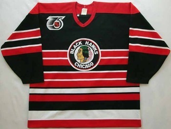


Came in the mail yesterday, at first I really didnt like the logo. But I noticed when you are not up close to the jersey and looking from afar the logo looks pretty sweet. But when you are the one wearing the jersey and look down it looks goofy. As for the rest of the jersey, I love it. After reading the description, I thought the numbers and name plate were going to be steam-pressed on. But actually they are sewn on, just not two layered like the authentic versions. They look like they are two layered numbers, but no. All in all I was pleasantly surprised.
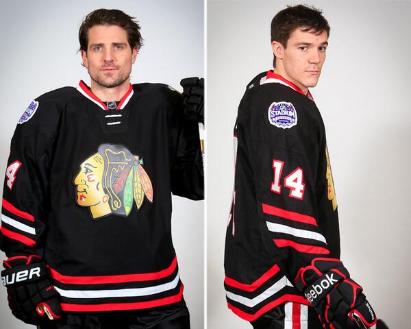
The crest is too shiny -what is it? Plastic or something? (on the new one for the outdoor game).... and why?