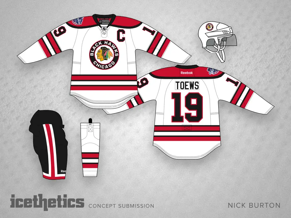
2015 Blackhawks Winter classic Jerseys = BORING!

mikita's helmet

CCS Donator
Donator
Joined:
Dec 10, 2014
Posts:
7,876
Liked Posts:
1,107
Location:
Anacortes, WA via Glenview, IL
If they would have made the shoulders red (or black), like the Habs do with their road jersey (see below), it would have given the jersey a little more oomph!  Red shoulders with a black helmet, or black shoulders with a red helmet.  Red is the new black    ...or is black the new red.  Regardless, so many choices, I shoulda been a fashion designer.</p>


classic_jersey_front_back.jpg
</p>


 </p>


1011-nickburton-wc15-chi.png
</p>
 

FlyChicaga

New member
Joined:
May 20, 2010
Posts:
68
Liked Posts:
19
Location:
Chicago, IL
<blockquote class="ipsBlockquote" data-author="Grimdust" data-cid="237165" data-time="1415251328">
<div>


WELCOME BACK FLYCHICAGA!!!</p>
</div>
</blockquote>


 </p>


Ha, thanks!</p>


 </p>
<blockquote class="ipsBlockquote" data-author="BiscuitInTheBasket2in17" data-cid="237172" data-time="1415280123">
<div>


Yea, I wish they had the crest that was cira the period of the rest of the design of the jersey (which might be enough for me not to buy one), but I like what they have done. Would have loved the white from the 1st season or the whites from the 1940s.


As far as changing the jersey, there have been quite a number of changes to the jersey over the history of the team, just not for a long time (other than 3rds and specials). http://www.nhluniforms.com/Blackhawks/Blackhawks.html</p>
</div>
</blockquote>


 </p>


The problem with the 1927's jersey is there isn't enough color. The jersey wouldn't market well on the NHL Shop.  :icon-rolleyes:  I think the early 50's white would have been an OK choice. This one really isn't bad, I just think the old Indianhead would have made it a LOT better. As an aside, I think the Capitals WC uniform looks pretty sharp.</p>
 

CLWolf81

Fan Captain
Joined:
May 15, 2010
Posts:
3,107
Liked Posts:
96
Location:
Chicago, Illinois
<blockquote class="ipsBlockquote" data-author="FlyChicaga" data-cid="237187" data-time="1415321493">
<div>


Ha, thanks!</p>


 </p>


 </p>


The problem with the 1927's jersey is there isn't enough color. The jersey wouldn't market well on the NHL Shop.  :icon-rolleyes:  I think the early 50's white would have been an OK choice. This one really isn't bad, I just think the old Indianhead would have made it a LOT better. As an aside, I think the Capitals WC uniform looks pretty sharp.</p>
</div>
</blockquote>


 </p>


You are likely the only one in the entire NHL to think so. </p>
 

Tater

CCS Donator
Donator
Joined:
May 15, 2010
Posts:
13,392
Liked Posts:
5,207
Please make the next GDT MassHavoc. They are undefeated so far when you start them.</p>
 

MassHavoc

Moderator
Staff member
Joined:
May 14, 2010
Posts:
17,843
Liked Posts:
2,550
We are going to just stick with one GDT now... because people are bitches. hah.</p>
 

Rex

Chief Blackcock
Joined:
Jul 17, 2010
Posts:
3,447
Liked Posts:
449
Location:
Grimson's Sweet Ass
<blockquote class="ipsBlockquote" data-author="MassHavoc" data-cid="237182" data-time="1415314390">
<div>


Same here, although they've started growing on me, especially after seeing what Washington is wearing.</p>
</div>
</blockquote>


 </p>


looks like our regular whites except the numbering is crap and the tomahawk is on the sleeve. </p>


 </p>


should have gone with the barber pole</p>
 

mikita's helmet

CCS Donator
Donator
Joined:
Dec 10, 2014
Posts:
7,876
Liked Posts:
1,107
Location:
Anacortes, WA via Glenview, IL
<blockquote class="ipsBlockquote" data-author="Rex" data-cid="237216" data-time="1415470748">
<div>


looks like our regular whites except the numbering is crap and the tomahawk is on the sleeve. </p>


 </p>


should have gone with the barber pole</p>
</div>
</blockquote>


Like I said, Boring!</p>
 

EspoForever

New member
Joined:
Jun 4, 2010
Posts:
470
Liked Posts:
0
Location:
North Muskegon, MI
I like these a lot better than the Wrigley jerseys...I don't care for the squaw at all.
 

Samurai

Ridiculum Anserini
Joined:
Dec 6, 2014
Posts:
1,865
Liked Posts:
872
Location:
Out Back Chopping Trees
I like the simple '57 look, but I agree that it needs a retro chief crest.</p>
 

Top